

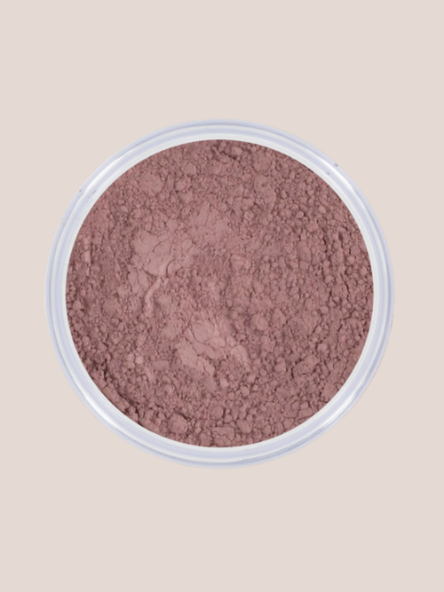
Blush Berry Blossom
A cool berry blush with a purple nuance. Gives clear colour without turning warm and matches the bright, cool winter world beautifully.
Bekijk productColour world · Winter
The winter type is usually characterised by a cool, clear and high-contrast look. Pure colours, clear dark-light contrasts and cool jewel tones can make the face look extra bright. Think fuchsia, cobalt blue, cool red, emerald green, purple, black and bright white. See this as a direction, not a fixed checklist: the overall picture and the effect of colour next to your face matter more than any single feature.

Winter is all about coolness, clarity and contrast. The natural colours of skin, hair and eyes often look more defined and less greyed than with Summer. The winter family includes True Winter, Bright Winter and Dark Winter, so not every winter type has exactly the same skin depth, hair colour or eye colour.
From very fair to deep. The undertone is often cool or neutral-cool. What matters is not that the skin is necessarily light, but that cool, clear colours and contrast support the face.
Often dark ash brown, black-brown or black, but there are exceptions. Bright Winter can also have less dark features. Natural warmth, copper and golden tones are usually limited.
Possible colours are bright blue, cool hazel, dark brown and almost black. With many winter types, what stands out is the clarity or the clear contrast between the iris and the white of the eye.
Usually high. True Winter is cool and clear, Bright Winter extra bright and high-contrast, while Dark Winter mainly combines depth with coolness. That high contrast clearly sets Winter apart from Summer.
Choose clear, cool and saturated colours with distinct contrasts. Jewel tones and pure basic colours often work well: think fuchsia, cobalt blue, emerald green, cool red, purple and icy accent colours. Winter can generally carry black and bright white better than the other seasons.
If you want to colour your hair, go for cool dark brown, espresso, ash brown, black-brown, black or cool silver and grey shades rather than copper, golden brown, honey or red-brown warmth.
Silver, white gold and platinum often match beautifully. For glasses and accessories, black, cool navy, wine red, cool red, purple and clear jewel tones work well.
Warm, earthy or strongly greyed colours such as orange, mustard, camel, terracotta and warm beige can dull the clarity more quickly. Soft powdery shades without contrast can also look a little flat on many winter types.
Cool pink, berry, plum and fuchsia often give a fresh, defined flush.
Cool blue, blue-purple, lavender, emerald, grey, anthracite, purple and black fit well within this colour world.
Fuchsia, raspberry red, cool red, purple-red, berry and deep cool pink shades often match strongly.
This selection was chosen for colour character and visual variety: berry, bright blue, cool purple, intense black and fuchsia. This gives the page the strong contrasts that suit the Winter type without everything becoming dark.
A cool berry blush with a purple nuance. Gives clear colour without turning warm and matches the bright, cool winter world beautifully.
Bekijk product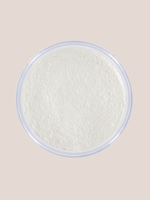
A bright, cool blue shade that suits the fresh, high-contrast side of Winter and combines beautifully with black, white and silver.
Bekijk product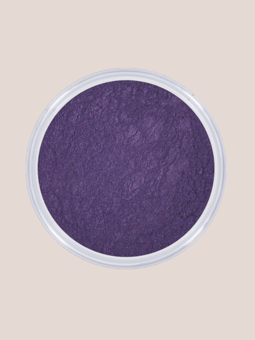
A deep purple eyeshadow with a cool undertone. Adds intensity and depth without shifting towards warm burgundy or brown.
Bekijk product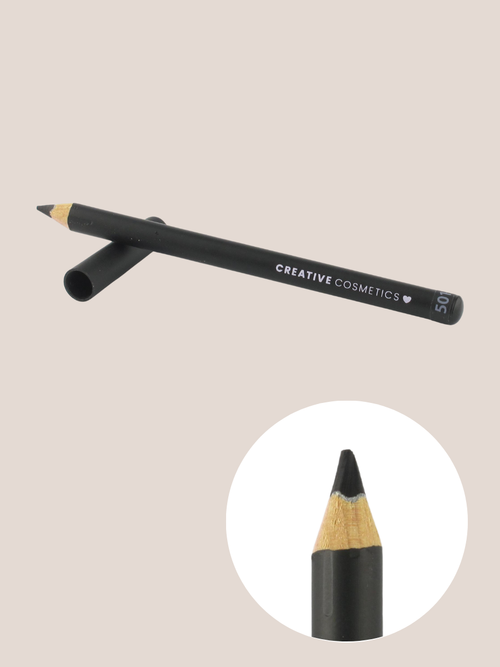
Intense black provides the clear contrast that Winter often handles well. Ideal for defining the eyes sharply and clearly.
Bekijk product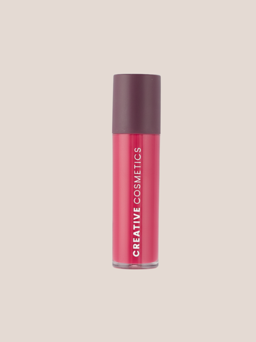
A vibrant fuchsia-pink lipstick with a distinctly cool undertone. Exactly the kind of bright colour that can work powerfully within Winter.
Bekijk productSeasonal colour analysis is a styling method, not an exact science. So always look at the effect on your own face in daylight. Are you between two colour worlds? Then a combination of both can look very natural.

Mooie kleur, oogt en voelt heel natuurlijk!
Bedankt voor je mooie woorden! We zijn blij dat je tevreden bent met de kleur en het natuurlijke effect. Liefs, Team Creative Cosmetics!
Fijne primer voor rode huid .
Deze hoort bij mijn dagroutine en zou hem echt niet meer kunnen missen
Hi, bedankt voor je enthousiaste review! We zijn blij dat de Balance Primer zo goed bij je past en een vaste plek in je routine heeft. Veel plezier ermee! Liefs, Team CC
Een mooie basisfoundation die ik al jaren gebruik en in de zomer een beetje meng zodat deze dezelfde tint heeft als mijn huid.
Wat geweldig om te horen dat je al zo lang tevreden bent met onze foundation! Bedankt voor je mooie review!
Prima mascara, blijft goed zitten, smeert niet onder je ogen. Geen hele dramatische look, gewoon een klein beetje extra oompf aan je eigen wimpers. Heel geschikt voor een naturel look
Dank je wel, Vanessa! Fijn om te horen dat de mascara perfect is voor een natuurlijke look. We hopen je snel weer te zien bij Creative Cosmetics!